Constructor HD: The old game survives but not revive in the modern world.
At first, I am disappointed with Constructor HD for its it doesn't revive memorable classical element well but transform into a hybrid (old and new) thing. How to bring new idea and preserve the classic is a big issue, for every old game wants to survive in the modern world.
The reviews prove that some people want new thing but not retro-style (terrible art for them), and few people want the game be classical as in the old time, the young generation just can't understand what is interesting or important of this game.

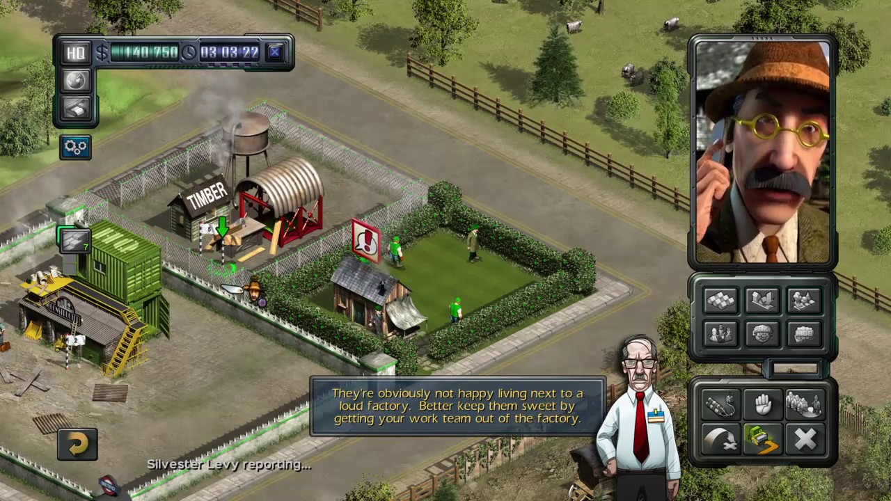
Although Constructor HD improves image quality as the name "HD" to see clearer the texture by zooming in (Theme Hospital Remake is doing so), it doesn't want to add more 3D models (It is a style similar to Wallace and Gromit's clay animation), just reduce cutscenes, and add some 2D luminous cartoon characters (Cartoon Network style) in it.
So there are two different art style in this game, and it is very conflict for me. I do enjoy the old broken 3D models, these models show a clumsy look which is very funny. But 2D cartoon style is just normal, not really unique enough.
But I think the real problem about art style is that the original 3D models doesn't fit into new 2D cartoons. Actually the remade characters look like very different with the original one. Everyone can remember Pac-man, Super Mario and Prison Architect, definitely not only because the gameplay but also its art style make the game unique. No matter Super Mario is in 2D or 3D, it preserve the basically classical element: Red hat, blue jeans with gold buttons and brown shoes (white gloves and jumping gesture also)
 But Constructor HD gives character too much insignificant details, for example the Gangster wore black pin-striped suit transform into a light blue-green suit and more exaggerated details on the face.

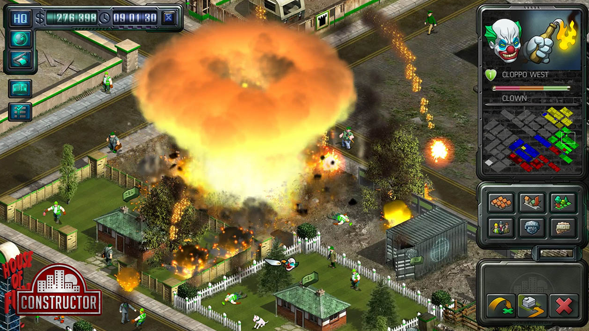
I suppose the other new things are just fine, such as new background sounds, exaggerated Michael Bay's explosion, and the undeveloped land with many cows. But I can't be fond of that showy monotonous color, the green of worker's jacket is just too shining. It looks like a cartoon character running into the real world(it is conflict with mostly realistic building and background.)
Some of the comments suggest the old 3D models in classic version is outdated. I don't suggest System3 should go back to 3D clay-like animation in the original version or not, but to mention the conflict between 2D comic style and 3D clay-like model, these two art styles are controversial, no harmony between them, System3 should choose one of them, no matter going back to be classic, or become Constructor 2, you can't just combine them as a messy graphic.

There are some good design in the classic version, it is worthy to compare with the HD version. In every house info page, Constructor HD's darker panel reduces its readability, also transforms the original golden relief icon into flat featureless marks, such as house title, value, tetant life. The panel has been redesigned with the electric wire of the panel but it tries to add its readability by adding the new square below and reducing the proportion of gorgeous background cars wallpaper, although the players can already get these information on the top of panel.
Another big difference between the classic and HD is control panel. In the Constructor Classic, it is steel-made continuous panel connect the right and left parts of controlling buttons and just like inset a screen at the middle as a fly machine panel. Constructor HD obviously make the right and left parts floating by disconnecting them. It seems like to provide wider screen for the players but it actually breaks the whole coherent integration.
Many of other games today use the modern floating style UIs but it is very different for Constructor HD's floating panel. For example, in my past reviews for FTL: Faster Than Light and Space Rogue, I talked about the UI between two of them, the latter one obviously imitates the former in a superficial way. FTL creates a continuous spaceship-like panel for its space context, I suppose everyone think it modern, but Space Rogue tries to simplify panel but actually empty it, it's just too floating. Another good example of floating panel is Prison Architect, it's floating but every button's icon at the panel is simplistic and corresponding to the whole screen of art style.
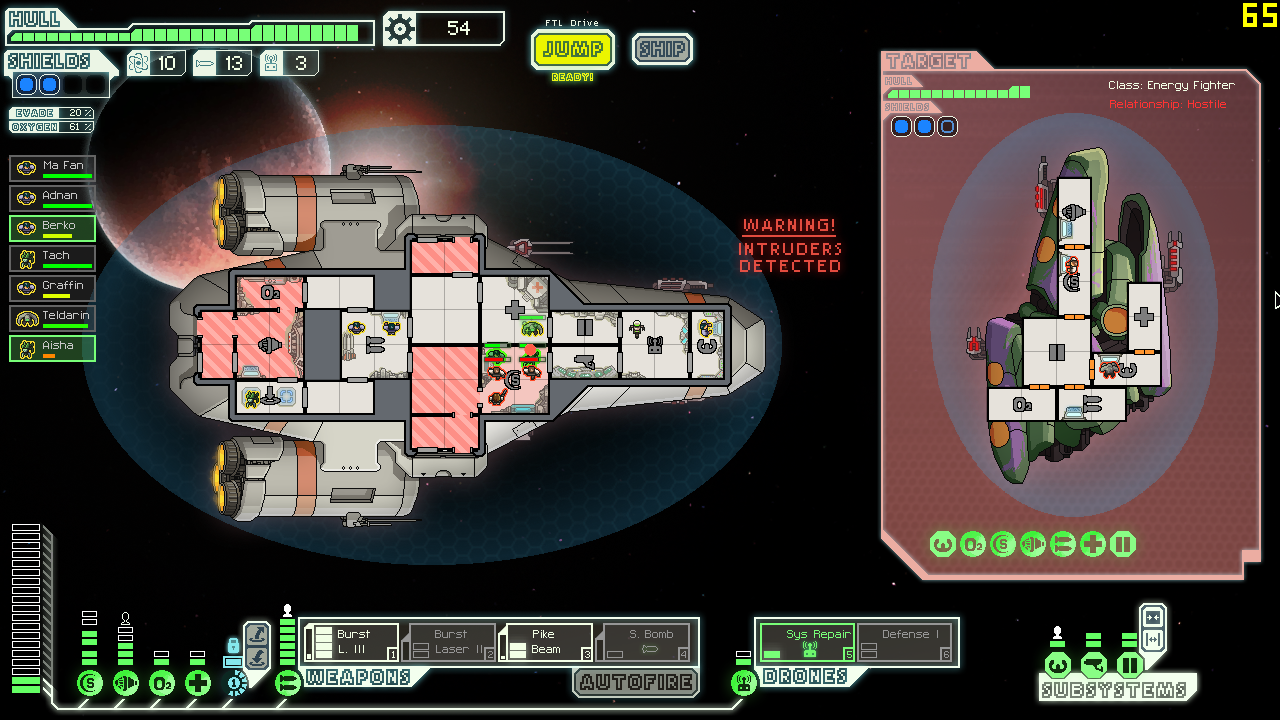
FTL's UI is considered continuous when it is still broken up into different sections. It doesn't really have to make the screen totally connected line by line as a square to feel continuous. FTL is best for its gameplay and the simplistic but harmonious UI desgin, such as it limits its color for light red and green as traffic light. Although these sections are not fully connected by lines, their similar color and shapes visually connect the different parts, also it sets very short interval between them. In Constructor HD, it is much wider interval between the right and left panels, and it is very complicated for the color and icon in each buttons. In Constructor Classic, the top and down section are comfortable green similar to the land of the grass. (The undeveloped lands are much complicated in HD), the left and right are designed in consider of Adjacent Colors, even the button's icon and color are similar to the panel's.

Although I am too much critical on these important details, there are many other details you are altering from the classic one, and they are very important to make this game wonderful!
It is still good to see the representative BrightPaw keeps replying promptly. It shows a responsible develop teamworks, it means a lot in this age of video game environment. They are very hurried to fix the bugs and update the new things. It has its own potential to be a great game again.
The reviews prove that some people want new thing but not retro-style (terrible art for them), and few people want the game be classical as in the old time, the young generation just can't understand what is interesting or important of this game.
Although Constructor HD improves image quality as the name "HD" to see clearer the texture by zooming in (Theme Hospital Remake is doing so), it doesn't want to add more 3D models (It is a style similar to Wallace and Gromit's clay animation), just reduce cutscenes, and add some 2D luminous cartoon characters (Cartoon Network style) in it.
 |
But I think the real problem about art style is that the original 3D models doesn't fit into new 2D cartoons. Actually the remade characters look like very different with the original one. Everyone can remember Pac-man, Super Mario and Prison Architect, definitely not only because the gameplay but also its art style make the game unique. No matter Super Mario is in 2D or 3D, it preserve the basically classical element: Red hat, blue jeans with gold buttons and brown shoes (white gloves and jumping gesture also)


I suppose the other new things are just fine, such as new background sounds, exaggerated Michael Bay's explosion, and the undeveloped land with many cows. But I can't be fond of that showy monotonous color, the green of worker's jacket is just too shining. It looks like a cartoon character running into the real world(it is conflict with mostly realistic building and background.)
Some of the comments suggest the old 3D models in classic version is outdated. I don't suggest System3 should go back to 3D clay-like animation in the original version or not, but to mention the conflict between 2D comic style and 3D clay-like model, these two art styles are controversial, no harmony between them, System3 should choose one of them, no matter going back to be classic, or become Constructor 2, you can't just combine them as a messy graphic.

There are some good design in the classic version, it is worthy to compare with the HD version. In every house info page, Constructor HD's darker panel reduces its readability, also transforms the original golden relief icon into flat featureless marks, such as house title, value, tetant life. The panel has been redesigned with the electric wire of the panel but it tries to add its readability by adding the new square below and reducing the proportion of gorgeous background cars wallpaper, although the players can already get these information on the top of panel.
 |
| Left is Classic version and right is HD version. |
 |
FTL's UI is considered continuous when it is still broken up into different sections. It doesn't really have to make the screen totally connected line by line as a square to feel continuous. FTL is best for its gameplay and the simplistic but harmonious UI desgin, such as it limits its color for light red and green as traffic light. Although these sections are not fully connected by lines, their similar color and shapes visually connect the different parts, also it sets very short interval between them. In Constructor HD, it is much wider interval between the right and left panels, and it is very complicated for the color and icon in each buttons. In Constructor Classic, the top and down section are comfortable green similar to the land of the grass. (The undeveloped lands are much complicated in HD), the left and right are designed in consider of Adjacent Colors, even the button's icon and color are similar to the panel's.

Although I am too much critical on these important details, there are many other details you are altering from the classic one, and they are very important to make this game wonderful!
It is still good to see the representative BrightPaw keeps replying promptly. It shows a responsible develop teamworks, it means a lot in this age of video game environment. They are very hurried to fix the bugs and update the new things. It has its own potential to be a great game again.


留言